My idea for my portfolio was to have a single scrolling page that focused on showing my work and telling everyone about myself and my skills. The links in the menu will take you to the different parts of the website and the menu is fixed so that the menu can be accessed from anywhere. The first thing I wanted people to see was information about myself so that they could see who I am. I then wanted to create a portfolio section that had my recent work in images that when you hovered over them would bring up a link to the site and give a little bit of information on the site. The thing I wanted to end with was contact information. If I used social media I would link those in the contact but my email, phone, and blogger are the only ones I have currently. Coming up with the idea was not too hard because I wanted a single scrolling page anyways and looking at the different portfolio websites gave me ideas for content in my portfolio.
My page is not finished because I spent a day working on my english final and others days working on late chemistry homework. I got the single page scrolling and the hover on the images going. I did not get much of my content in and the nav bar is still a bit wonky. I will probably continue working on this outside of class after break.
Tuesday, December 19, 2017
Friday, December 1, 2017
TV25
When we started this project I really had no idea that there were still antenna stations that were still looking to get new advertisements. I thought that the ones that still exist were just going to die off. The website our client made themselves was very lack luster. There was not much to work off of design wise and the logo probably needed to be redone. I started off by creating some variants of a new logo but tried to make it keep the similar look of our clients original logo since he seemed to be leaning towards that. I did not decide on any colors for the logo. He said that he wanted a slideshow type thing in his website so I mainly focused around that aspect in my mock - up site with the content being underneath. On the first site I made I focused on trying to make the slideshow the focus of the page. When I was working on this page the way I laid out the slideshow and the menu did not leave enough space for me to incorporate the logo without it looking cluttered. In the second site it is a similar design but the menu scrolls with you on the page allowing to to see the logo and simply scroll to the slideshow/content. Color is something that I am not great with so the site has a plain black/white/grey color scheme.
 |
| Logo |
 |
| Mock up |
 |
| Site 1 |
 |
| Site 2 |
Wednesday, September 13, 2017


Friday, September 8, 2017
Yara Yarn Colors
Here are some color variations of the logo. THEY DO NOT ALL HAVE A YARN BALL AVAILABLE. My favorite 2 so far is the blue one and the red one. I still do not know if I want to keep with 1 similar color or if I want to add in more colors since yarn comes in many colors.


Thursday, September 7, 2017
Yara Yarn Logo update
New

Old
I was gone Friday so just started on this today. Ignore the color and how badly drawn it is. I mainly wanted to use either a cursive looking font since yarn is kind of that loose curvy shape. My idea was to either use some variation of Y's or to mainly use Yara. I want the text to be a yarn like texture. I found a way to make a rope like texture and I hope once I get a better color I can make it more yarn like. I think that I might need to make the end of the pattern actual ends and I might need to draw it by hand because with a mouse it looks a bit sloppy.

Tuesday, September 5, 2017
Yara Yarn Logo
New
Old
I was gone Friday so just started on this today. Ignore the color and how badly drawn it is. I mainly wanted to use either a cursive looking font since yarn is kind of that loose curvy shape. My idea was to either use some variation of Y's or to mainly use Yara. I want the text to be a yarn like texture. I found a way to make a rope like texture and I hope once I get a better color I can make it more yarn like. I think that I might need to make the end of the pattern actual ends and I might need to draw it by hand because with a mouse it looks a bit sloppy.Friday, August 25, 2017
Wordpress.com VS Wordpress.org

Tuesday, August 22, 2017
Maps
Our client is wanting a map on their website similar to maps on sites like Zillow, Trulia, Realtor, etc. This map will allow others to see what the clients work they have done in pictures and they will be able to find houses near their area that the client has done work on. Most of these sites most likely are using google maps and embedding it into them. Using google maps would be the easiest way to create a map like this. You are able to make areas and spots on google maps and add links and hover effects to them. 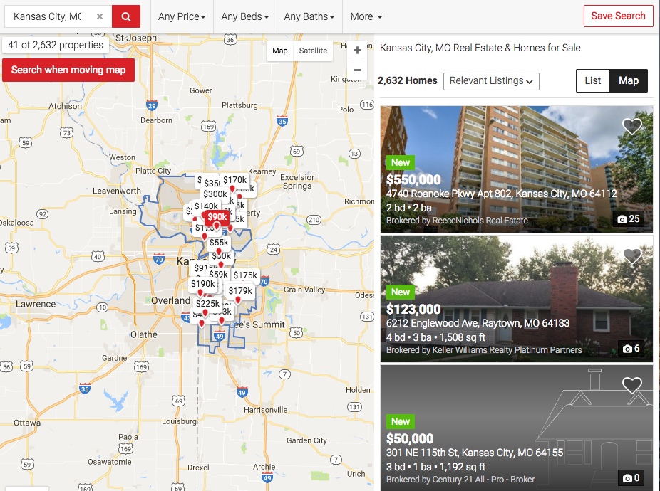 |
| Realtor Map |
 |
| Realtor Pop Up |
 |
| Trulia Map |
 |
| Trulia Pop Up |
 |
| Zillow Pop Up |
 |
| Zillow Pop Up |
Thursday, May 25, 2017
Reflection
Final Reflection
Technology
The biggest thing I am taking away from technology is being able to adapt to new things. Earlier in the year all of the Adobe applications updated and it changed many things. The biggest was CSS inDreamweaverr. I had to figure out how to use the CSS compared to the way it used to be. I had to be able to change the way I worked in Dreamweaver in order to continue.
Collaboration
The biggest things I am taking away from collaboration is clarity between people. I learned this when we did our first website of the year. We had to talk with each other on things about our self and give a different fact to each person. This became easier if the person had already planned out what their fact was. It was also better if they explained more one something that would be considered confusing. I will always try to make sure that information I give will be clear and detailed when need be.
Communication
My takeaway from this one is similar to Collaborations. I mainly want to be more clear and detailed with information I give and receive. This is especially important when talking with clients because you want to make sure that you are getting any specific details they have and making sure that everything will get done on time.
Project Management
My takeaway from project management is managing time when you're gone. I was not gone a lot this year but when I was I could really tell when I missed a day. The best thing to do would be to work on your project outside of class. There was one project that when I missed a day it really set me back so I worked on it during a seminar.
Leadership
There was not a lot to show leadership this year but my biggest takeaway would be to make sure that everything that needs to be done gets done. If I were in a group for a project I would make sure that everyone had something to do and to use everyone talents to their best ability. If someone was good at making graphics and someone was good with CSS I would make sure to give them the right tasks.
My greatest Strength is Project Management. I am able to judge time and when I need to get things done. I know how fast I can complete things and how long it may take me to do something. My biggest weakness is Collaboration. I am not one to talk with people much so I could improve on it.
Overall this has been a good year where I learned a lot. I know what I need to work on and what I don't need to work on. I will take what I have learned and apply it to things I do later in life. I think I most need to work on my Collaboration
Tuesday, May 23, 2017
Texture Site Mock-Up

Friday, May 19, 2017
Texture in Web Design
Texture is normally looked at as a grungy kind of style but it actually is very useful when used correctly. It has many uses that can add visual appeal to something.
You can visit Smashing Magazine for an in-depth tutorial on texture.
A. Texture can be overlooked because it can be thought of as a dirty design. It actually can bring a whole design together but should not be the focus.
B. Patterns are usually smaller images that repeat over and over. Texture are usually larger images that do not repeat.
C. You can use a textured object against a clean background or a clean object against a textured background.
D. Texture can catch your eye and lure it toward the textured area.
E. It can add to personal or unique aspects about your sites.
F.
- You need to make sure that if you are using textures that you make sure everything is still easy to read.
- Do not use too much texture to the point that it is distracting.
- Practice using texture before you apply it to a real project.
- If you don't need to use texture don't.
- Think about how you will use texture before you start.
- Whenever you come across something you can use; save it immediately so you don't have to find it later.
- Masks are a safe and efficient way to apply texture.
- Make sure your textures are high quality instead of worrying about loading time.
- Use textures that make sense for the topic.
4.
Maptia
Old Town Spice
The Kettle
Uinta Brewing
Thursday, May 18, 2017
ColorHexa Chrome Extension
What Is It?
This extension is called ColorHexa. It allows to to find or input a color code and find out all sorts of information on that color. One great thing is that it will also show color schemes for that color you choose. It even has the color conversions for about any kind of code. This extension would be best used by designers or anyone who is using many colors or trying to make a color scheme using a certain color.How To Use:
To use this extension you first click the extension then enter your color code or search for a color with the + button. After you do that it will pull up a page with a ton of information on the color you chose. |
| Extension |
| Search Bar |
 |
| Color Information |
 |
| Schemes. Alternatives, etc. |
Conclusion:
I think that this extension is very easy to use. The hardest part is probably coming up with the code for the color you want or even having to decide on a color. The sheer amount of information you get is a little overwhelming but it has so much useful information its hard to say its a bad extension. I would overall say that it is a great extension that provides information that you may not of even known you needed. It would be a great thing for anyone that has need of finding things like color schemes and alternate colors.
You can download the ColorHexa extension for Google Chrome here
You can download the ColorHexa extension for Google Chrome here
Font Finder Chrome Extension
What Is It?
This extension is called "Font Finder". It allows you to select an element on a page and it will show you the CSS for it. So not only do you get get the font but also any other CSS that is associated with it. This would most likely be most useful for a web designer to be able to see CSS on an element of the page in a clean looking window.How To Use:
Using Font Finder is very simple. You Simply click the extension then click the element on which you want to see the CSS for. A window should then pop up with the CSS for the element you selected. |
| Extension |
| Element |
 |
| Font Finder Window |
Conclusion:
This extension is extremely easy to use. It may be very simple but just using for something like finding the font of a word it is fast and works well. I think that if this is something that sounds like something someone could use then they should definitely try it.
You can download the Font Finder extension for Google Chrome here
Monday, May 8, 2017
Website Redesign


Monday, January 9, 2017
Flash
 Flash allowed webpages to have more complex animations to the site and it also allowed the implication of video and flash games. It also allowed for everything in it to be the same for everyone instead of it possibly being different. Although flash was huge for sometime it declined in popularity when it was not implemented in the new iPhone. Steve Jobs believed that the new HTML 5 would replace flash and be better overall due to browsers being able to build on it. However since HTML 5 was not as develop yet flash still ran many popular sites like youtube videos or facebook games. In 2011 Edge Animate was released by Adobe to create HTML 5 for mobile devices. Adobe admitted that HTML 5 was better for mobile devices instead of flash. In 2015 Youtube made its default
computers. Adobe discontinued Edge Animate and made Animate CC. Animate CC allowed HTML
5 and Flash to be developed. Facebook is still using flash for its games but there is very few parts of the web that still use flash. Google announced that their browser Google Chrome would block flash by default but will still be able to turn it on. Flash is definitely dying but it is something that should not be forgotten. It was a large part of the webs history and without it the web would not be what it is today. There are many archivists trying too keep flash in archived sites.

Subscribe to:
Posts (Atom)