
Wednesday, December 9, 2015


Friday, December 4, 2015
Masks


The basketball was made by copying the original basketball onto a new layer and changing its color, then made a layer mash and put a white to black gradient using the gradient tool to create the multiple colors.
Wednesday, December 2, 2015
Moving Mountains

Shadows


Tuesday, November 10, 2015
Creative Brief
1.Color preference?
10. Words to be close together or farther apart?
Wednesday, October 28, 2015
Article Review
"Creative Anarchy at Its Very Best"
This article is about design and creative ideas. It tells how design has rules and you need to break those rules. The author argues that you need to break the rules and take risks in order to make you art stand out. Don't just do what everyone else is doing try something different. A strength of the article is that it is inspiring and can get you thinking about things you may not have thought about before. A weakness is that it does not have much information regarding the subject. The general conclusion is that you have to take risks, know your stuff, keep learning, and break the rules. I think that the article is interesting because i never thought about breaking rules when I am designing. The author does not really support their argument with much information just a lot of claims and opinions. There is not much evidence in the article. Things that help me are when it talked about taking risks. Something i don't understand are the rules. What are the rules exactly? I thought that this was interesting to read but I thought it was not very informative.
Wednesday, October 7, 2015
Pattern and Motif


Wednesday, September 30, 2015
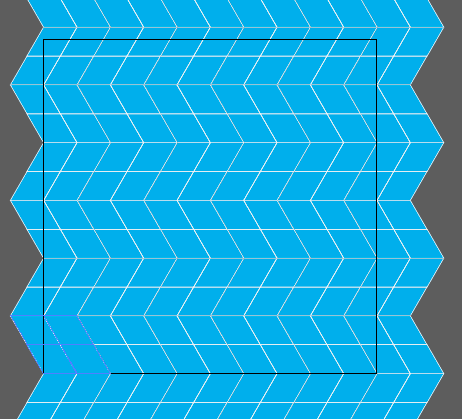
Orthogonal Pattern Tutorial
 |
| 1 |
1. First off we are going to make a 50 pt line.
2. Next get the Rotate Tool and Option click an end anchor point on your line and set the angle value to -120 and press copy take notice of the height of this new line, mine is 43.301 this will be important for later .
 |
| 2 |

3. Now option drag the lines until you have something that looks like picture 3
 |
| 3 |
 |
| 4 |
5. Now go to the appearance panel and add a new fill to the group and set whatever color and stroke you want.

 |
| Add New Fill |
6. Now with the group selected go to effect > transform and change the horizontal move to 100 pt and set the copy to whatever fills the rest of your art board horizontally


7.Now with the group selected select the reflect tool and option click the group and do a horizontal reflection and copy it.


8. Now select both groups and transform it again but this time vertically and whatever the height of your line was before put that in but make it negative and multiply it by 4. Once again make the copies whatever fills your art board vertically and there is your orthogonal pattern.

Tuesday, September 22, 2015
All About Colors
Color Words
In HTML it can recognize words as colors like if you type in blue it will accept that. There are many weird colors as well like papaya whip. So just about any color name that you can think of you can type in for the color.Hexadecimal
 Hexadecimal color code is represented as #000000. The first 2 representing Red the middle representing Green and the far most right 2 representing Blue. #000000 is black while #FFFFFF is white. The numbers can be anywhere between 1-9 and A-F, A being like the number 10, B being 11 etc. Depending on how high each set is is how much of the color is present.
RGB & RGBA
 RGB stands for Red, Green, Blue just like in Hexadecimal but it is a little different. RGB has 3 different numbers representing Red, Green, and Blue respectfully. The number can range from 0-255 and the code looks like (0,0,0). In RGBA the A stands for Alpha which effects the transparency of the color going from 0-1. 0 being completely transparent and 1 being completely opaque.
In conclusion, you can put colors in HTML a variety of ways and they all have their ups and downs. You can use whichever you prefer when making a webpage.
Links to stuff:
TBL and Hexadecimal Color Sampler
 In the Tim Berners-Lee page I learned how add a border to a picture and how to add an image, I used the image tag and adding a border in the styles section.
For the Color Sampler i used what we learned about hexadecimal codes to make black to white and a rainbow of colors.

Friday, September 4, 2015
Pencils and More
 A take away of mine would be that when making something like the cup you have to use more than 1 shape in order to do things you want. Another is that Making sure everything is arranged and aligned property is important because with my item all of the cards had to look correctly in front of each other, like the 3rd card can't be behind the 4th and also with the cup the top part had to be behind the pencil but the bottom had to be in front. Another thing I learned that was useful was that you can round the edges of edged objects even more and be able to make a shape the size you want before you make it.

Thursday, August 20, 2015
What is Graphic Design?


When you look at an image of just about anything it is graphic design. Graphic design is a way people can use to express something like emotion or a hidden message. Graphic design affects your life more than you probably know it. If it is simply looking around town at buildings and their logos you experience graphic design in everyday life. Graphic Design even helps you decide what to wear if the clothing has a design on it. It could even influence what you buy at the grocery store. If there is a container that you like then you my be more enticed to buy it. Graphic design is different in everyones eyes to some you just see everyday colors and shapes but to others you see a deeper meaning and almost a bond with some designs.


Links:
http://www.aiga.org/what-is-design/https://www.youtube.com/watch?v=sTi5SNgxE3U
Wednesday, August 19, 2015
3 Sites, Then and Now
 |
| LoL 2015 |
League Of Legends Website
 |
| LoL 2011 |
The League of Legends site has improved a lot since its first release. Navigating is much easier due to the more organized structure of the pull down tabs. Due to the increase of people and the community it helped the website become better pretty quick. To me it is also more visually appealing than the old one as well.
In the 2015 website less code is used in order for the website to work. The Code is also more condensed in the 2015 compared to the 2011. It almost seems as if there is more code in the 2015 because it is condense because the older one is more spaced which i can assume that because of how HTML has changed this is why it is different like that.
 |
| LoL 2011 |
 |
| LoL 2015 |
Pokemon Website
The pokemon website is the oldest website I am looking at and it looks very different. First the original website was called Pokemon World which is different from what is now just Pokemon. The site now looks better to the eye and is not a yellow blob with a blue background. There are more tabs and they are more organized that in the older one.
 |
| Pokemon 2015 |
 |
| Pokemon 2015 |
 |
| Pokemon 1999 |
 |
| Pokemon 1999 |
Hearthpwn Website
 |
| Hearthpwn 2013 |
 |
| Hearthpwn 2015 |
 |
| Hearthpwn 2013 |
 |
| Hearthpwn 2015 |
Since this is a newer website I found that most of the coding looked very similar but in the new one it seemed there was not long code but more of it. There was more links in the new one and because it has the curse look to it, it has the some of the same code as other websites that use the Curse Client
The Wayback Machine
The Purpose of the wayback machine was to allow ANYONE free access to anything that is stored on the internet. This can be used for whatever reasons. If you are researching something than it can be used for finding things on the internet that may not be there anymore. It can even be used fr a project like this comparing old to new websites. I know I enjoy just looking at how older websites and be amazed at how much they have changed and improved. It has thing other than websites as well suck as different texts, audio, images, and software.
Subscribe to:
Posts (Atom)